
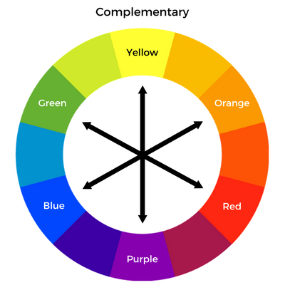
Color Tricks
in Styling
As the contrast color begin to trend in fashion, lot’s of designer start to play with the colors. Colors are looking great with each other, but for us-normal people’s daily wear-lot’s of color are not good styling together. Here we have provide you some color tricks in styling to help you with daily outfit styling.
The similar color match will never wrong in styling, and this rule can be founded in most style that looks comfortable. Similar color in the same color range so they can live in harmony. But if there’s other color come in, the scene will looks mess up.
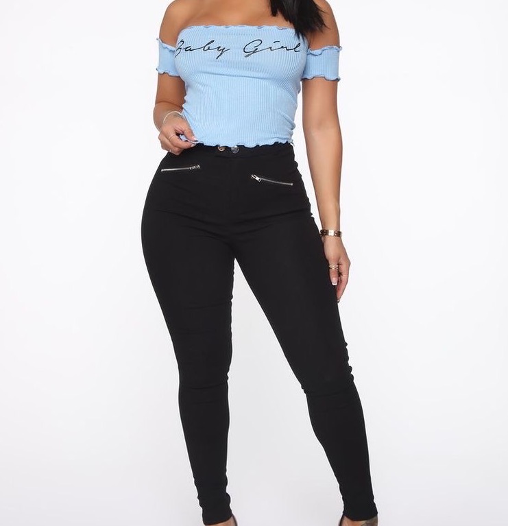
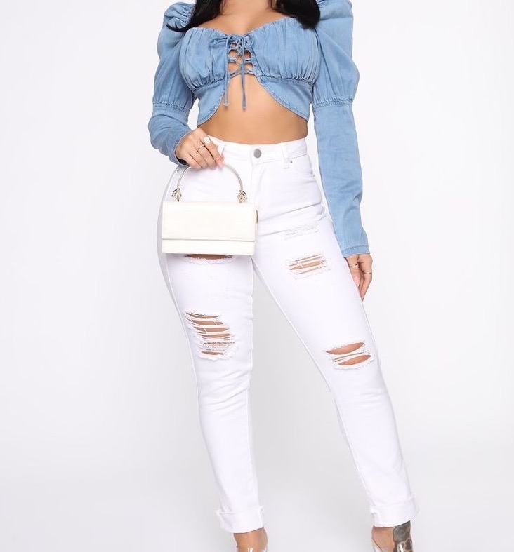
A quick example: Which outfit do you think it’s more comfortable and stylish?
I guess lot’s of people choose the right one. The light blue with white look more harmony and comfortable. The light blue with black pants is not ugly, still works for daily wear but not fashion.
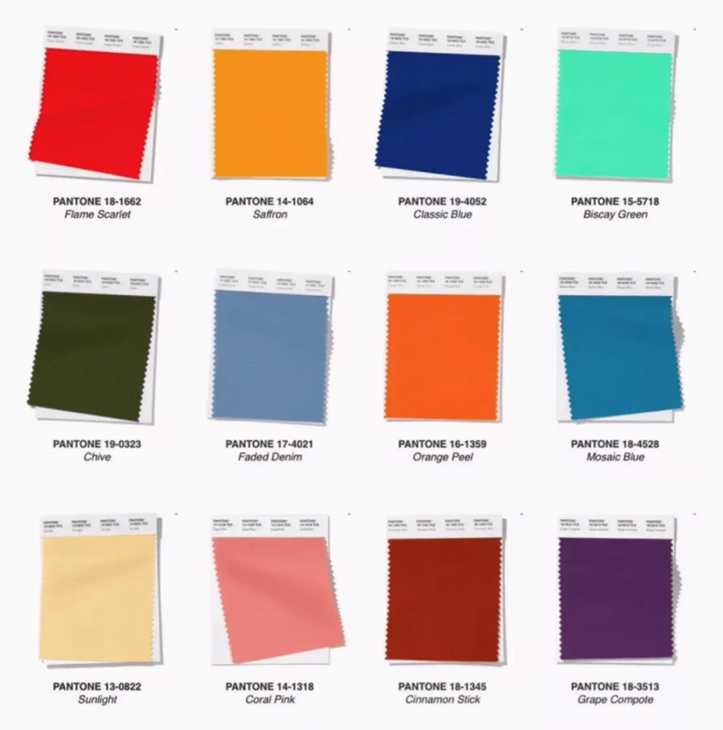
Desaturated Color
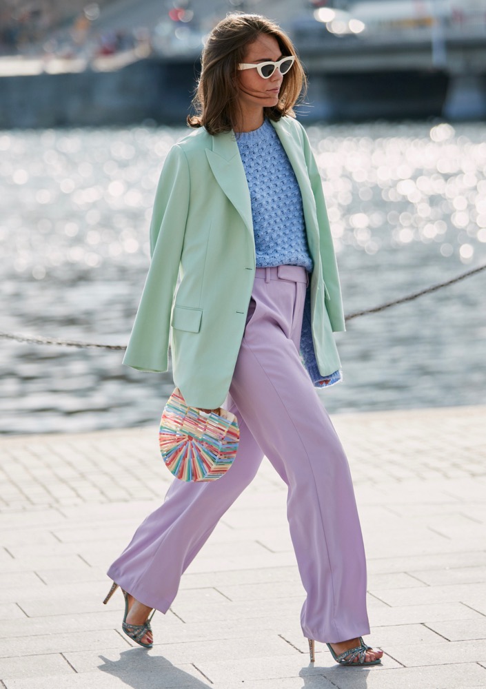
WRONG EXAMPLE
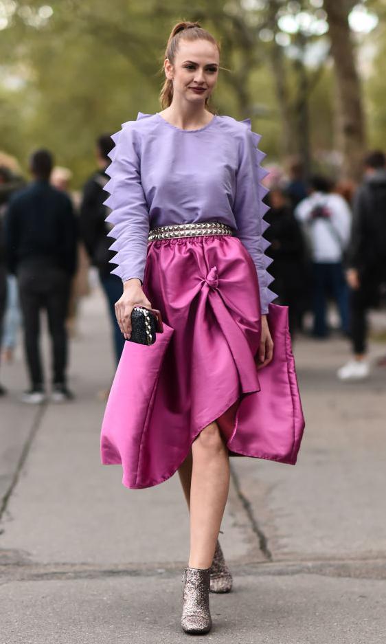
RIGHT EXAMPLE
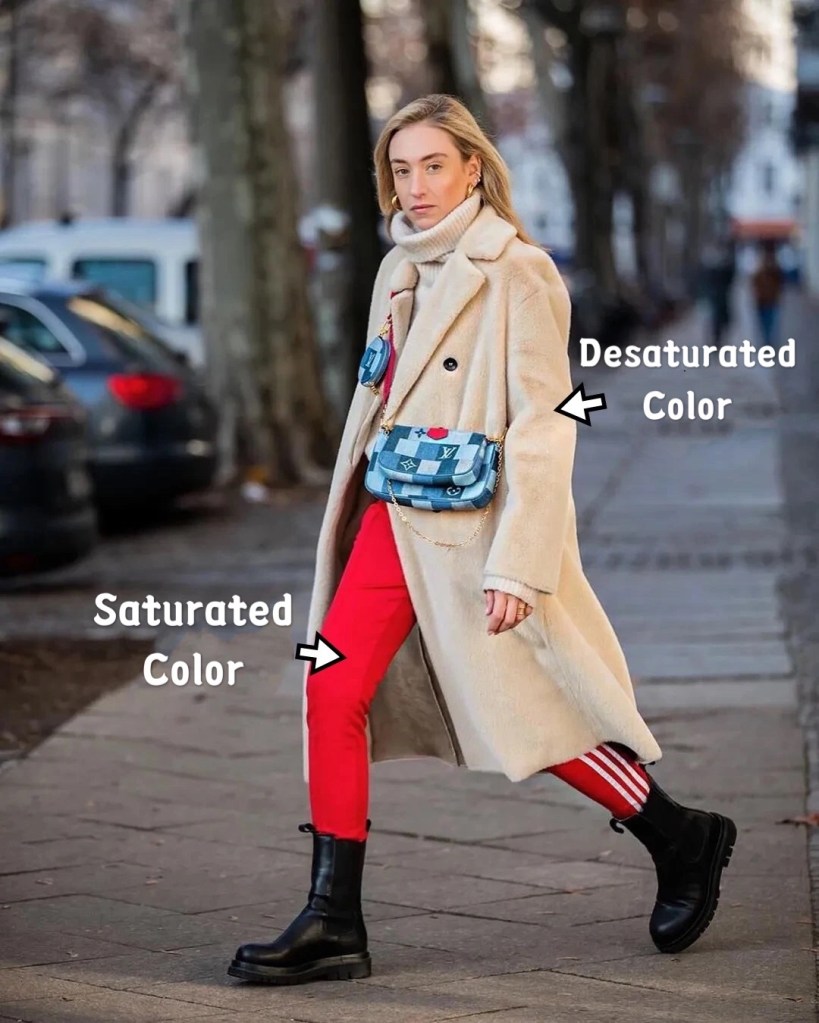
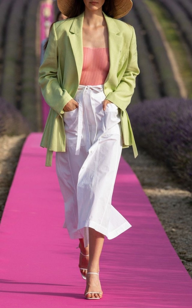
The desaturated color has been really popular lately. But be careful! The desaturated color can look high fashion when the whole outfit are desaturated color, otherwise it will loos kind shaded and dirty feeling by compare with saturated color. Like the example in the left, the bright red color make the cream color coat feels dirty so make the whole outfit don’t have trendy feeling. But the picture in the right use baby blue match with cream color so the whole outfit looks harmony and trendy.
So use this idea when you want to wear something desaturated. Also if you think the desaturated color still not sure seems comfortable or not, you can always use white to balance them.
Jacquemus 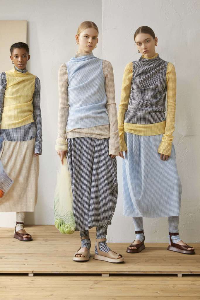
Jill Sander 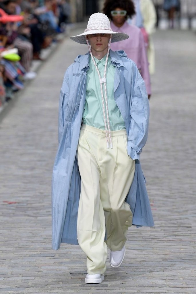
Louis Vuitton
Saturated Color
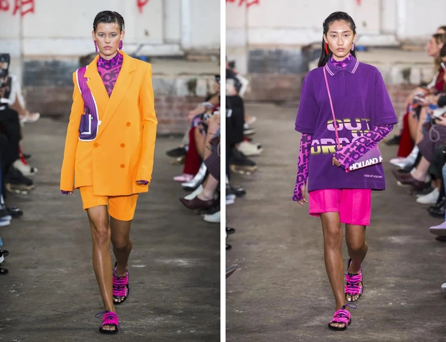
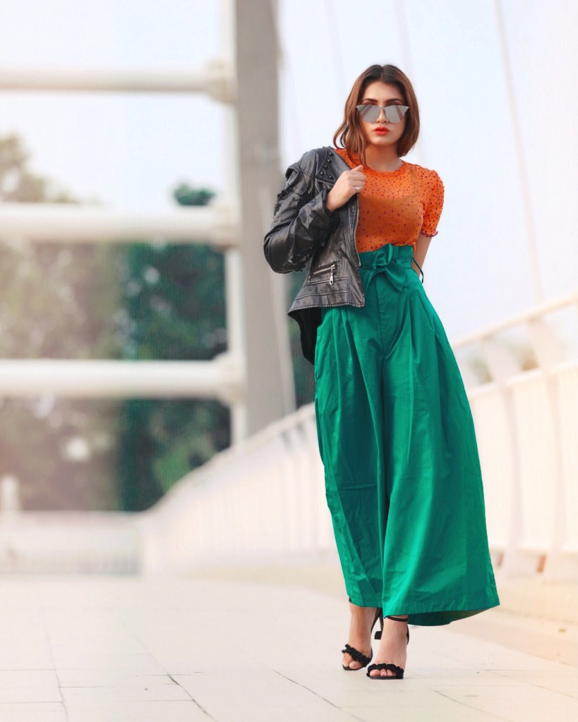
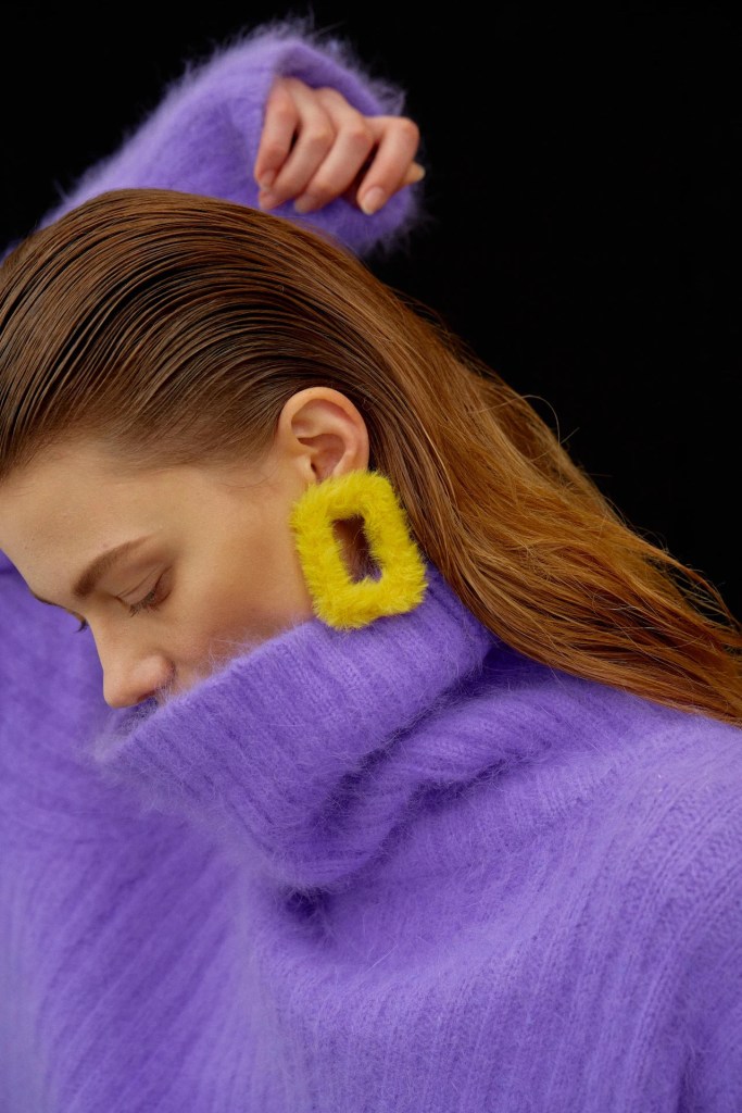
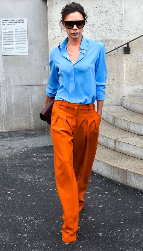
We have seen lot’s of saturated color match used in runway shows. It looks good in the models walks in the runway, but for our daily life we can not handle it.
Some main element of saturated color contrast styling are fabric choose and area balance. And most importantly, use the complementary color to contrast.
-Different fabric choose can separated the colors so it won’t look too bad.
-Area balance, large one color and the other one use as accent color so the colors won’t fight each other.
-Complementary color contrast won’t look too weird, it will looks comfortable.
So how to wear contrast color?
Rule of 631
60%
Basic Neutral Color
30%
Sub Color
10%
Accent Color
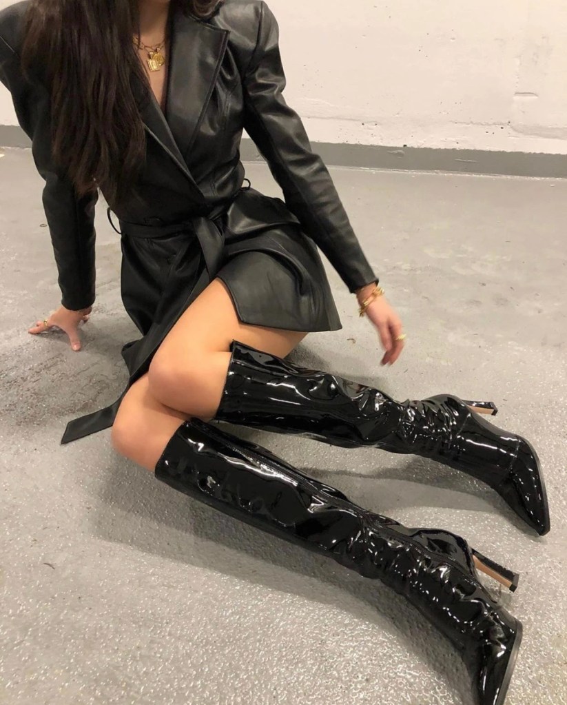
Black Color
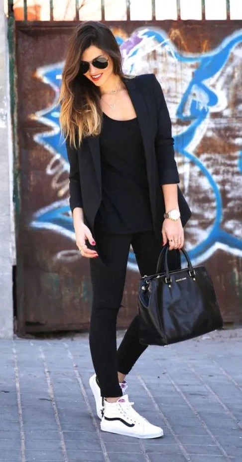
Black color plays an important role in fashion, especially with white. They always great with each other. But in certain item, black and white would only cause weird look. Simple example: white socks and black leather shoes for men. This is absolutely NO. Everybody knows it. But do you know that black pants with white shoes also not matching? Especially when you don’t have any white element in the outfit.
It’s not an absolutely No case like white socks and black leather shoes, it depends. The loose sport pants may work fine but the black tights would look little bit weird.
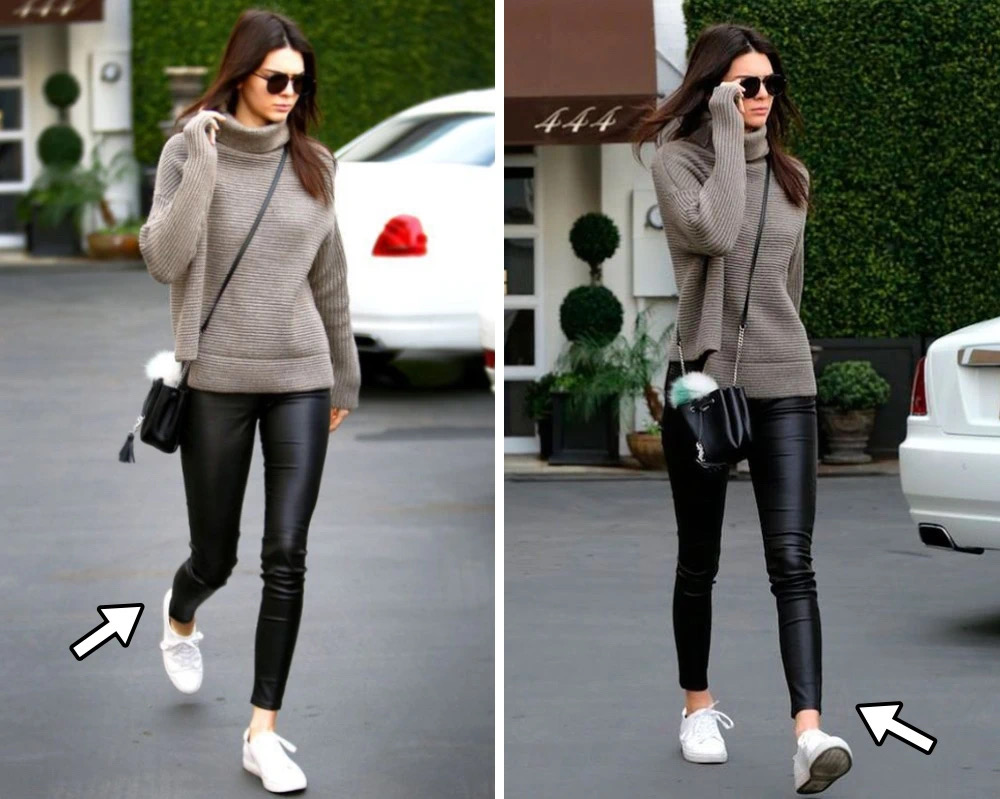
My suggestion would be wear all black bottom or shows some area of the leg to balance the strong contrast of the black and white color.
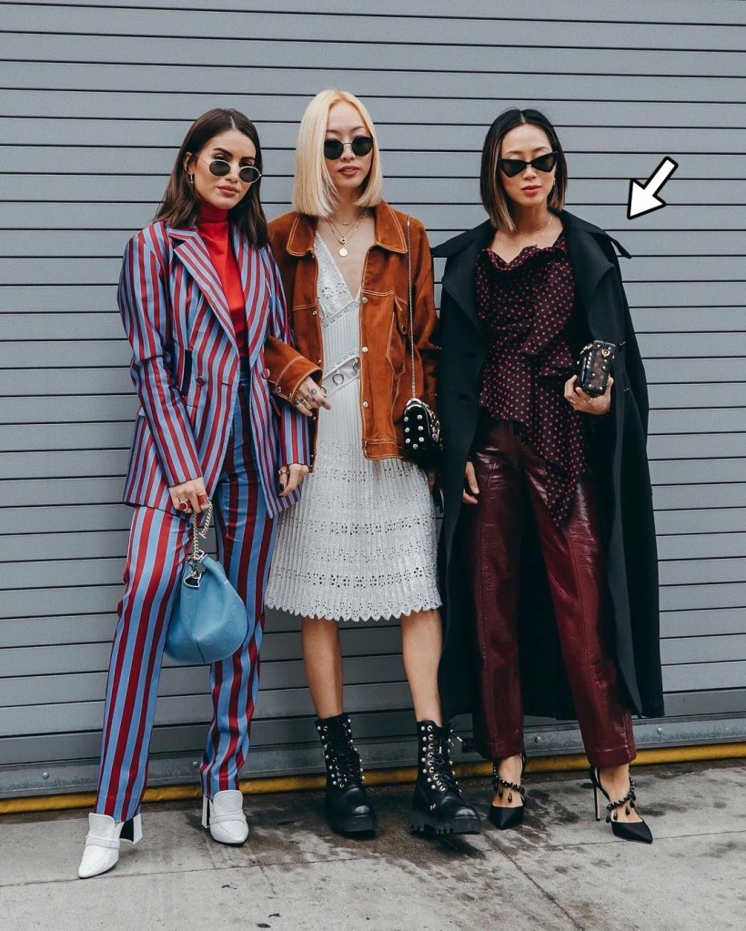
Another No case for black it’s not match black color with dark color. Black+black it’s cool and modern, but black+dark it’s too mature in a bad way. Especially when you with someone colorful like the picture, it’s too much.
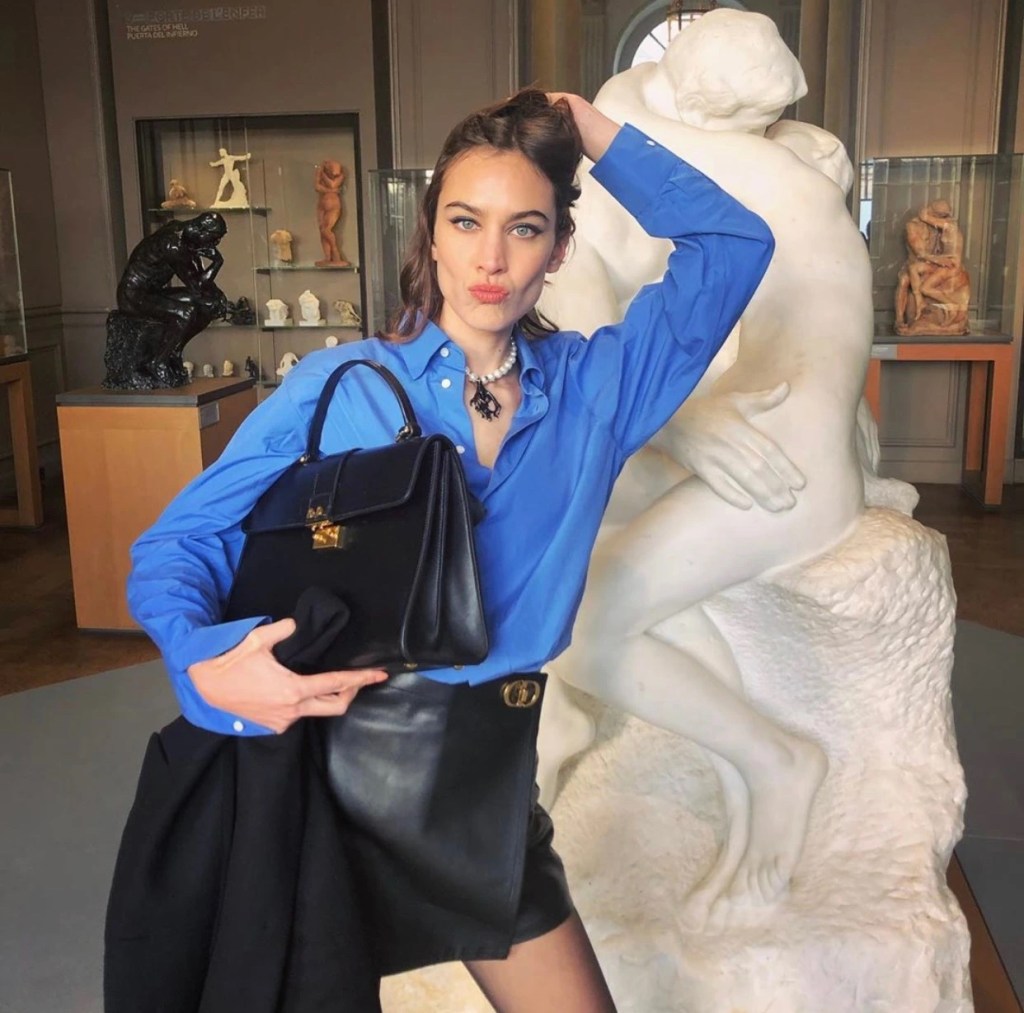
Black color still need some accent color in the whole outfit so it won’t feel too heavy and balanced the mature of the color.
So here’s all the tricks of color in the styling. The main idea it’s to help you with daily styling in trendy way! I believe after read this post you will have some new idea about styling your outfit! As the summer coming, I hope this can help you with the new season clothing buying and more!
Do you like this post? Share it with your friend! And if you like our blog, don’t forget to subscribe us and share us! We will provide latest fashion trend and news for you!
